Showing posts with label acrylics. Show all posts

Sunday, September 6, 2026

Paper and Fiber Journal

Here's a flip-through of my most recent, almost complete journal. It's about 5" x 5", bound by sewn-over-tapes with a canvas cover. The video is a little rough since I'm just starting to learn about filming and posting videos (so no music or special effects). 

Three signatures hold pages of my various pieces of acrylic-painted watercolor papers and fabrics. 


Monday, August 21, 2023

Experiments with High Flow Acrylics


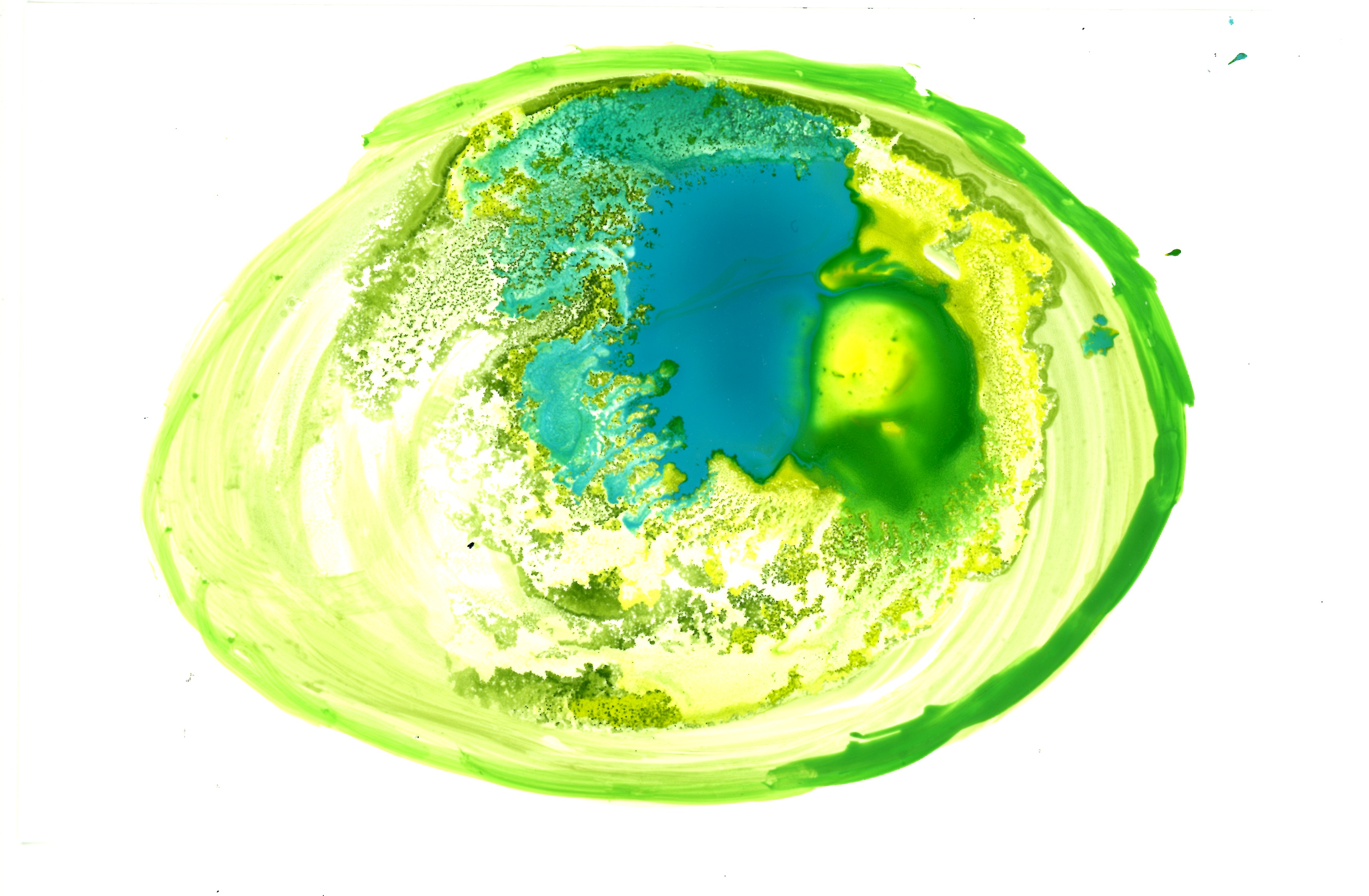
These are some of several pieces I did back in mid-March experimenting with High Flow Acrylics on glossy photo paper. I liked the vivid colors, fast drying time, and interesting designs that occurred. Trying different techniques, I dripped small drops from the bottles but also used a small paint brush as well as tried a new tool, an air blower. I might have tilted the 4” x 6” surfaces to encourage movement.


Looking at these now, I can’t help but think of before and after events in my life. I was playing with this process on my birthday vacation week off, just days before my dear love went into one hospital and then another and stayed for almost a month before he passed away. My creativity, like me, went into shock and then later disappeared as I dealt with more pressing matters. I am still navigating the wild waters of grief and loss (and probably will be for some time). But slowly, oh so slowly, I’m doing a bit of painting or gel printing or working on a page spread in an art journal or trying simple projects. 


Friday, July 9, 2021

Printmaking with Natural Materials and Open Acrylics


After ordering some Golden OPEN acrylics, I had a fun session testing them out.


Materials

3” square mini gel plate

The end of an orange

Leaves

Flower blossoms with stems

Golden OPEN acrylics

Mixed media papers—7” x 10” and 9” x 12”


Previously I had used craft, heavy bodied, fluid, and high flow acrylic paints. But the consistency of the OPEN acrylics seems very well suited for gel printing. You don’t need to use a lot of paint, especially on the little plate.


I made many square grids on the papers. Once I got the hang of it, I was happy to see I could make some ghost prints. As the flower blossoms absorbed more paint, they created lovely imprints and outlines.

I live in a humid city, made more so with the recent rains. The OPEN properties keep the acrylic paints from drying so quickly and you have more time to set up your prints.


Friday, April 9, 2021

Printmaking, Oh Printmaking


Seems like every weekend I’ve been printmaking and creating piles of prints. There is the good, the not so good, and the downright ugly. Some need more work. Some might like gel pens or colored pencils on them. Some that I use to clean the plate with are almost as interesting as the ones I carefully compose.

Printmaking is a lot work before and after. Prep work to get papers ready, a space cleared, paints selected, a work surface to work on, a place to put all the prints you finish. Then, it takes quite a while to clean your tools—stencils, masks, palette knives, bone folders. It’s been a time-saver to wear gloves!


Experimenting with different papers, as usual. Computer paper, card stock, various types of greeting cards, watercolor paper, mixed-media paper, printmaking paper. You need a lot of paper. Printmaking paper is so dreamy that I’d like to make an entire journal with prints from it. I have some on hand in both tan and light blue and could begin using the folios for printing and only bind it as a book when all the pages are done.

Mixed media paper is quite good also. Shelley Rhodes great tip of carefully snipping papers from coil books has been helpful but I also rip it out when I need More Paper NOW! Interestingly, the snipped or ripped pages both readily return to the book. I like that some brands feature a front cover that is as sturdy as the back.

Some artists don’t completely clean the paint off their plate before changing colors and actually like the gungy remains. I tried doing that with these three prints. You can see some yellow ochre paint coming through earlier prints. At first, I didn’t quite like it but have come around to see the beauty in its messy imperfections.


Wednesday, March 31, 2021

Drying Area for Gel Prints


I have doing lots of printmaking lately. There are so many inspirational videos from the various commercial gel plate brands and their artists. But what I haven’t seen much of is where to put prints when they are wet.

From the first time I used gelatin up to now, the room I was working in was always full of prints drying wherever there was a surface—couches, chairs, folding card tables, the floor! There had to be a better way since now I don’t have space in the living room because my work computer is set up there. My friend Nancy and I discussed various options and I set about trying one. She suggested rigging a rope from wall to wall and using clips.


I had lots of frame wire on hand and with a quick trip to the grocery store had some light weight wood clothes pins. On the walls, I screwed in medium hooks. On the wire, I made a loop at each end. I spaced out the clothespins with some wood beads to give the prints space.


It turned out pretty good. I like that it is portable and I can take it down.


Sunday, September 16, 2018

Playing with Mixed Media in an Altered Book “Myths and Legends”


In May, I signed up for an online art journal class called “21 Secrets, The Best of 2014 & 2015.” Inspired by Catherine Anderson’s class Media Remix I decided to alter a hardback book for my experiments.

Using craft acrylics, I laid a background base. Then added magazine images, sometimes just the silhouette, and worked the pages with Caran d’Ache Neocolor II water soluble crayons as well as using Sakura Gellyroll Moonlight markers. On some spreads, I also added highly textured objects (my handmade stamp or my hair band clip) and did some rubbings with the crayons; that worked terrifically.


I really like using these different media on the page spreads. In the past, when trying to use a hardback book and artist grade heavy bodied acrylics, I would get frustrated because the paper just couldn’t stand up to that kind of paint. But craft acrylics is perfect since there isn’t a lot of thickness to it and not much pigment. The kind I used--DecoArt Americana--looks very matte on the page when scraped thinly with a plastic card or palette knife. And with the addition of the crayons, there was no chance the pages would stick together.


The original title of the book is “Myths and Legends of Ireland” so I’ve called this art journal “Myths and Legends.” Because I’ve started it with this distinctive style, I’m inclined to continue doing page spreads with these same ideas. Do you ever do that? Does it make it harder to change it up? Why do I feel every spread has to echo the previous ones? If an art journal a place of experimentation why keep everything the same? It does add to continuity to keeping a theme. Another altered book I did—and finished!—used only collage images; my tools were a sharp scissors and a glue stick. Tell me what your art journals are like.


Monday, January 15, 2018

Two Colorful Leather ID holders


With our department move last summer, we need access to doors using our campus ID cards. I made one for myself and recently two more for friends. 

First, I looked through my leather supply of scraps and larger pieces and found expressive embossed parts for the fronts. Thinking of my friends, I wanted a green and brown garden theme for one and a red flower theme for another.


Painting the raised designs with artist grade acrylic paints and a small paint brush, I then wiped off some excess paint and let them dry. Next was hand sewing the bottom section of metallic snaps. 


Experimenting with upholstery thread on a scrap leather piece, I used my new sewing machine with a size 18 needle. It looked good on the front and awful on the back, so I switched to a navy polyester thread, going very slowly. Encouraged with the results, I sewed the two holders together with good success. I still have a lot to learn about sewing a straight stitch, but I was happy with the results. 


For the red flower one, I selected a bit of embossed leather for the top flap with plain leather for the back.


On the green holder, I needed to hand stitch the top snap two different times until the snaps worked well. To hide the stitches showing on the top flap, I scrounged around for a button or such and found a small metal leaf with holes on both ends. It tied in well with the garden theme.


Later, I added two eyelets in the back and a length of leather cord so one of my friends could wear the ID holder around her neck.

Really loved the way these turned out! 


Sunday, April 3, 2011

Journal Spread


Journal spread
acrylic on paper
5.50" x 8.50"


I’m experimenting in a commercially-made journal, the Strathmore Visual Journal. This is the 140 lb. watercolor one. Not sure I like the spiral across the spread but it does help working completely flat. I found this quote last week and really love it.

Sunday, January 24, 2010

Storm of Creation


Arctic Cold Front & New Moon
18” x 12”
acrylic on paper

Have you ever calmed yourself down by doing art? When you are feeling strong emotions, do you channel it into creative expression?


Crevice
12” x 18”
acrylic on paper

Recently on Mary Buek’s blog, she mentioned "art will save the world" and I believe it! Because it can save you, me, and countless others by re-focusing our current emotion—whether it be pain and turmoil or elation and joy—and coming out the other side with art born from pounding the keyboard, flinging paint, gouging stone or wood, or flooring the sewing machine pedal. Being such sensitive souls, artists have chosen to express their deep feelings by creating, not destroying. When our inner storm has passed, an expressive, heart-felt, even break-through piece of creation can be held in our hands. Looking closely, we may be even be communicating with ourselves, seeing a message only we can discover.


Beneath the Dunes
12” x 18”
acrylic on paper

Sunday, December 6, 2009

Autumn Leaves

'Tis fall and seems only natural to collect leaves on the ground and roll them into acrylic paint. All are 9" x 12" on cold-press watercolor paper.


Saturday, November 7, 2009

Experimenting with Collagraphs


Celtic Horse
Collagraph
acrylic on computer paper
8.50” x 11”


Have you ever tried making a collagraph? It is a type of printmaking where you build up the surface, rather than subtracting (as in making a stamp). You can use any kind of firm material for the base (cardboard, mat board scraps, canvas board, etc.) with various glued down flat objects (leaves, fabric, coins, etc.). With such a range of ingredients, it can be very creative.

Long wanting to make a collagraph, I could not settle down and decide on a premeditated design so I looked on my shelves, thinking about what size to use and found an unfinished painting on Gessobord. It had been an experiment—the first time I had tried using an acrylic medium called string gel. Dipping a palette knife in the jar, I then lifted it and swirled it over a section of the rigid surface.

Now, I was curious—would it make a good collagraph? Since it already had a raised design on the surface, I wouldn’t have to wait for everything to dry overnight (or longer). Bonus--I could play now!

Trying various papers and full-body acrylic paints on hand, I first tried rolling paint on a brayer and transferring it to the raised design. It didn’t work very well, so I switched, using a brush to put paint on the hardened string gel. This yielded much better results.

Limiting myself to just three colors (blue, teal, brown), I began to see a horse’s eye, a muzzle, and then an abstract body. The swirls reminded me of Celtic knots and spirals. Cool!

I tried other variations, using Cotman 140 lb. w/c paper, inkjet translucent vellum, and beige cardstock. Surprisingly, the plain computer paper showed the most details.

Tuesday, May 19, 2009

Experimental Journal

Acrylic gelatin print on canvas
9.75” x 11” album cover

Looking through some of my collage and journal-making books, I felt like doing something quite different. I remembered a blank “Just-the-Pieces” album I’d put together with the gelatin print cover. The pages are sturdy black cardstock, intended to hold photographs. Last year,
Andrea Platt demonstrated some wonderful drawings she did on black paper using colored pencils and gel pens and-–YES!—that’s what I decided to try!

Appropriating part of a magazine cover having a wonderful array of blues and greens, I cut and glued that to the first page and began playing with the colored pencils. It is truly amazing how the black page is so utterly different and how it becomes part of the design.


I used green, blue, and white colored pencils with some gold metallic gel pen highlights. Nothing was precise or planned but the squiggles and lines and blips were mark-making of the highest form of fun! It was very relaxing, too, just doodling in different colors and allowing the strong black background speak for itself.

Sunday, May 10, 2009

Fire Dancer

Fire Dancer
9" x 12"
acrylic on paper


Back to painting this week, I was trying a technique in Mary Todd Beam’s new book The Creative Edge: Exercises to Celebrate Your Creative Self using pieces of plastic to make rock-like texture. When I tilted this first try, I immediately saw a figure, perhaps a tribal dancer wearing an elaborate animal costume, holding a flaming torch.

Right now, I am of two minds—add some more defining facial features (but I'm not confident or comfortable drawing people!) or leave it as an abstract figure.

What do you think?

Sunday, March 1, 2009

Fighting Paper


Circle of Questions
acrylic on paper
9" x 12"


I struggle with cold or rough watercolor paper. Doing quick brayer paintings, that bumpy, uneven surface repels paint, leaving white dots all over my watercolor block. Texture gets lost as the paper has so much itself. Not what I’m aiming for. But, in an effort to use this paper, I tried working around its short-comings.

Introducing texture of my own--hand-carved stamps, textured fabric, colour shapers, even plastic ends from a roll of calculator tape--created some interesting discoveries.

Crowing Glory
acrylic on paper
9" x 12"


At several junctures, I spritzed sections, laid a paper towel over it, gently lifting some paint. I used a lot of white in this grouping, something relatively new for me. It toned down my usually riotous colors and helped blend them.


Search Light
acrylic on paper
9" x 12"

Monday, February 9, 2009

Thank You, Mary Buek


Mary Buek collage
7" x roughly 8.25"


This is one of Mary Buek's wonderful collages and I just received it in the mail today! Mary was having a very generous give-away last week and I was so fortunate to receive this one.

Go here and read how she created it http://marybuekart.blogspot.com/2008/12/kept-practicing-collages.html and while you're there, enjoy her colorful and creative blog. She now has an Etsy store, so you can find something you like, too.

Thank you, Mary!

Sunday, January 25, 2009

Fabric of Memory

Those who sketch often mention that studying and then rendering a scene on paper is more beneficial for reference than taking a photograph. Recently, I had the opposite experience.


Cutting a piece of corduroy to press into my wet acrylic paint, I turned the fabric over and saw an outline strongly reminding me of an Irish site I had photographed. Two churches, the old next to the new, were both dedicated to the female Saint Gobnait. Standing in the roofless older church, I had angled my camera shots to look toward the newer chapel’s sharp turrets. Within this fabric, I saw a bulky building with a pointed steeple-like shape and I was thrown back in memory to that misty afternoon.


Debating about whether to continue or consult my photos, I couldn't ignore this challenge and decided to follow where the Muse was beckoning. I put down my trusty brayer and picked up a big brush.


Memory of St. Gobnait's
acrylic on paper
9" x 12"


After completing the basic shape and adding some green countryside, I was deep into my memory. I did not stop to glance at my photos until later. And when I did, I was almost disappointed, wondering if I needed to continue working or start another more faithful to the original site. As you can see from my photos, it is not recognizable as that place in Ireland. But in the process of painting it I connected with a fabric of my memory.


This painting might not be the best, but it meant a great deal at the time. If I had deliberately tried to match my photos, I might not have had that energized shock of memory and might have lost interest in reproducing reality.


That seemed the best part--and maybe what was what I was after in the first place. The painting stands on its own now, a short-hand for that experience, and in no way a realistic rendering. Actually, I’ve done many quick paintings that moved me, profoundly and mystically, that aren’t much to look at. In those cases, it’s something I discover in the painting experience rather than the resulting painting itself that is important.


The more personal iconography an artist uses, the more true it reflects their soul, don’t you think? That was one reason for returning to Ireland--to take photos and use them for painting reference. Ironic, then, when I didn’t even follow my own images but rather my own feelings. And that made it so powerful.

Sunday, January 11, 2009

Taking It Further

Boundless
acrylic on paper
9” x 12”


Back into the routine, I did a few good paintings by deciding to take them further. With brayer paintings, I’m doing the equivalent of sketching. You know, flexing the wrist, throwing color and form together, pressing things into wet paint, seeing what happens, playing. It’s always the discovery that thrills me. When I plan a composition, it never quite turns out the way I envision and then I’m trapped with a not-very-satisfying experience and painting. But I also have lots of flops by going so fast, leaving a disappointing experiment to start anew instead of working with the previous one. This week, I was slower to put pieces aside as “done” and gave them some time to develop.

Do you ever go far in a piece? Or like me, not far enough? Sometimes that extra step can spell ruin or enlightenment. It’s such a fine line. I struggle with composition and pure play. Do I make something that pleases me or does it become a mish-mash? Is the experiment too busy and now only has one good section?

With these two, I wasn’t pleased with the beginnings but went beyond. Both are on cold press watercolor paper, not my favorite texture since it takes forever to roll paint into all those cracks and crevices. But in “Boundless,” I allowed myself not to fill in every nook and I actually like the result.


This opens up a new way of working that could be very beneficial. It might also limit the number of failures (rescued only by cropping for mini-paintings, cards, book covers)!


Wondrous Universe
acrylic on paper
9” x 12”

Sunday, December 21, 2008

Happy Holidays

At this time of year
While we await the return of the light
I wish you a very happy winter holiday season!

Peace
acrylic gelatin print
9" x 12"

Wednesday, July 23, 2008

Painting Large

Untitled
14" x 20"
acrylics on paper


These two untitled acrylic paintings on paper were done entirely with a great new 2" brush I recently purchased. Intended to be a gesso brush, it felt so good and was so different than anything I'd tried before that I decided to paint with it alone. It was a very interesting experience.


Untitled

9" x 12"

acrylics on paper

Saturday, July 5, 2008

Gelatin Printmaking 202


Yesterday I had another session with gelatin printmaking with another friend. Since I’d seen a recent YouTube about doing a double exposure on the same print, I was in the mood to experiment. In addition to two large jelly roll size pans, I filled two box acrylic frames with gelatin for some smaller sizes to play with.

Again, I tried a lot of different “paper” to print on. Here's one below on oriental paper.


And one on a piece of white fabric.


For the first time, I used an Ampersand panel called Claybord. The smooth clay ground picked up nuances in the paint and I was very pleased with the results. Those white shapes might be when the gelatin had broken.


Also new, I tried some canvas paper that originally came in tablet form. Nancy noticed it would throw white irregular dots onto each print and we weren’t sure why.


In addition, I used two 6” x 8” canvas boards with the intention of using them as covers for a book or art journal. They came out well, but with those interesting white spots again (see below). Nancy and I decided to call them “snow,” my husband called them “stars” and they didn’t disturb my landscapes but rather enhanced them. Perhaps it was the rough canvas grade or the gesso coating?


Once again, the best results were on 140 lb. Fabriano Artistico hot press watercolor paper. It picked up all the intricate colors and textures but their cold press variety worked well, too. This size of 9” x 12” fit the large pans well and I didn’t have to cut them further.


Nancy had a great idea when I was thinking of using crumpled foil for texture. She said it might be too harsh on the delicate gelatin; why not try some tissue? After rolling out paints, again using Liquitex heavy body acrylics and Golden Fluid acrylics, I crumpled up some archival tissue and randomly laid it over the gelatin, not smoothing it down. Quickly, I removed it and placed the receiving paper on the gelatin plate. What a fantastic texture it created, especially using transparent colors!


I used more stencils this time, having cut out some basic circles, squares, ovals, and rectangles beforehand. Blue painters tape made a fine mountain range, as I had learned before in my other paintings. It lasted quite a while, sticky side down on the gelatin, and I pulled many good prints from it.


I brought out two different Celtic stencils I’d made, one from acetate, one from white card stock. Of course, the acetate created sharper images but I liked the results of the long, more imperfect card stock better. The one below is on cold press watercolor paper.


This one is on white card stock.


The most exciting stencils? Weeds from the yard that looked like wheat. I’d picked them shortly before we began and was pleased they worked so well for so long. Because of their bulk, I thought they might break the gelatin, but they didn’t.


I also used some beautiful lacey fabric Nancy brought.


Here is some Japanese white lace paper used as a stencil in the wet paint. Sometimes I removed it, sometimes I left it on.


Nancy brought letter stencils and did some innovative work with words, something I hadn’t thought to do. She also did some great geometric pieces using thin strips of paper, as well as combing the paint with different types of brushes and combs before printing. We both had a laugh whenever our brayers rolled up our flat elements while we were “inking” (spreading acrylics) across our plate. Sometimes we were able to rescue and replace our stencil element.

The larger tray of gelatin broke on Nancy first, so she tried the smaller 4” x 6” and 5” x 7” molds. When we began, she had turned them out of their acrylic box frame molds onto some plexiglass sheets. She said it was nice to not have to worry about the pan’s border (I’d left the larger gelatins in their jelly roll pans). Since I was enjoying working larger, I kept using my large tray until my gelatin finally broke, after about 6 hours! By then, I was ready to slow down and pull a few more prints before finally quitting.


Again, I learned so much. Nancy and I thought perhaps the gelatin keeps acrylic paints moist and more workable. I’ve tried some printmaking on glass but have never been pleased with the results, perhaps because acrylics dry so fast. With this process, I did get some pieces that weren't 100% wonderful but there were parts of those I can use. Instead of wild experimenting with each print, I really stuck to a theme and enjoyed how the same basic print looked on different paper, fiber, canvas, and watercolor weights. What I liked most was seeing things in the finished print I hadn’t planned. They are delightful accidents, like the “snow.” When my gelatin broke, I kept working the whole surface and that area of break now resembles a lovely bowl shape. There is enough spontaneity in this printmaking to make me really happy with the unplanned result.